Risk disclosure: Independent research finds 70–84% of Polymarket traders lose money (Sergeenkov, April 2026; Akey et al., SSRN, March 2026). Forex CFDs: 70–85% retail loss rate. Binary options: 80%+ in most jurisdictions. AI agents don't change these baselines. Full disclaimer.
Candlestick charts are the standard way traders visualize price, and once you can read them, market action becomes far more legible. Each candle packs four pieces of information — open, high, low, close — into a single shape that shows who won the battle between buyers and sellers in that period. This guide teaches you to read candles from scratch, recognize basic patterns, and — importantly — understand their real limits.
We'll keep this practical and honest: candlesticks are a useful tool for reading price, not a crystal ball. The pattern-reading mythology around them is mostly overstated, and we'll say so.
TL;DR — The 30-second answer
- Each candle shows open, high, low, close (OHLC) for a time period.
- Green/up candle: closed above open (buyers won). Red/down: closed below (sellers won).
- The body is open-to-close; the wicks are the high and low extremes.
- Patterns (doji, hammer, engulfing) hint at sentiment shifts — weakly.
- Honest caveat: candlestick patterns are widely overstated; context matters more.
- Useful for reading price action; not a reliable standalone prediction system.
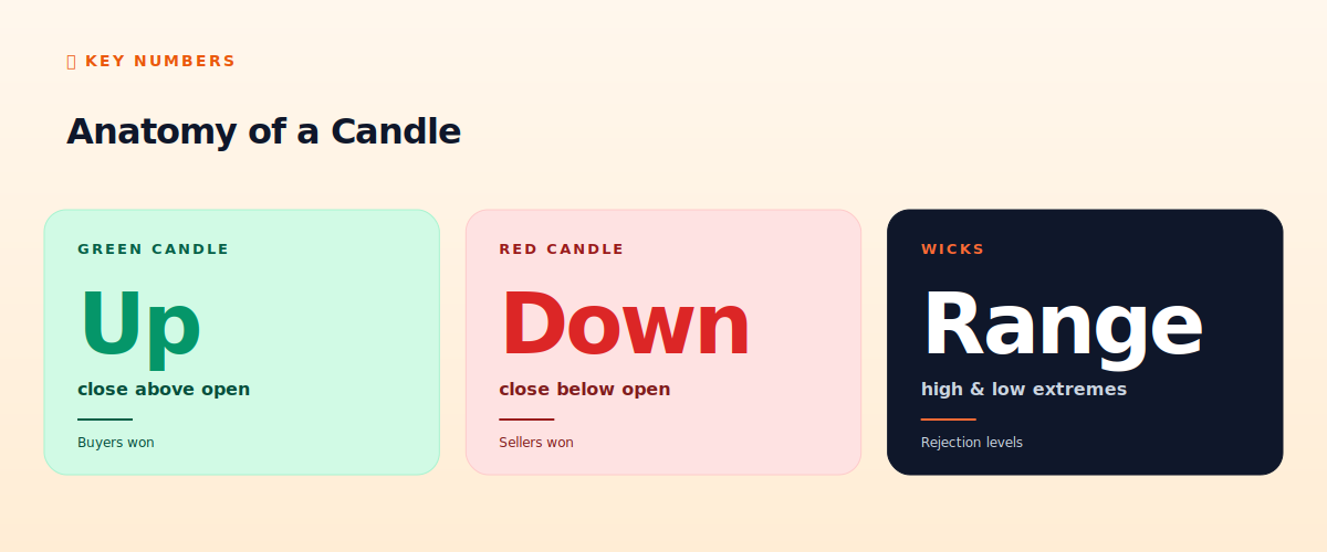
Anatomy of a candle
The four numbers in every candle
A single candlestick represents price action over one time period — a minute, an hour, a day, whatever timeframe your chart is set to. It encodes four prices:
- Open: the price at the start of the period.
- Close: the price at the end of the period.
- High: the highest price reached during the period.
- Low: the lowest price reached during the period.
The body of the candle is the rectangle between the open and close. The wicks (or 'shadows') are the thin lines extending above and below the body, reaching to the high and low. So a single candle tells you where price started, ended, and how far it stretched in both directions — a compact summary of the period's battle.
Green vs red
Color shows direction. A green (or white) candle closed above its open — price rose over the period, so buyers won. A red (or black) candle closed below its open — price fell, so sellers won. The size of the body shows conviction: a long green body means strong buying, a long red body strong selling. A tiny body means buyers and sellers fought to a near-draw.
The wicks add nuance. A long upper wick means price pushed up but got rejected back down (sellers stepped in at the highs). A long lower wick means price dropped but buyers pushed it back up (buyers defended the lows). Wicks often mark levels where one side ran out of steam.
Basic patterns (with honest caveats)
Certain candle shapes have names and supposed meanings. The common ones:
- Doji: open and close nearly equal (tiny body). Suggests indecision — neither side won.
- Hammer: small body with a long lower wick. Suggests buyers rejected lower prices — possible bullish reversal.
- Shooting star: small body with a long upper wick. The bearish mirror of the hammer.
- Engulfing: a candle whose body fully 'engulfs' the previous one's. A bullish or bearish engulfing suggests a momentum shift.
Here's the honest part most guides skip: these patterns are widely overstated. Studies repeatedly show that individual candlestick patterns have weak-to-no predictive power on their own. A hammer doesn't reliably predict a reversal; an engulfing candle doesn't reliably signal a trend change. The patterns appear constantly in random price data too. Treat them as mild hints about sentiment, not signals to trade on. Anyone selling a course built on 'powerful candlestick patterns' is overselling.
What candlesticks are actually good for
Candlesticks earn their place not as a prediction system but as the clearest way to read price action. They let you see at a glance whether a period was bullish or bearish, how strong the move was, and where price got rejected (the wicks). Combined with context — the trend, key levels, volume — they help you understand what's happening. The value is in reading the market clearly, then applying actual strategy (regime, levels, risk management from our strategy guides), not in mechanically trading candle shapes.
Timeframes matter
The same asset looks completely different on different timeframes. A 1-minute chart shows noise; a daily chart shows the meaningful trend. As a beginner, favor higher timeframes (4-hour, daily) — they filter out noise and the candles carry more information. Lower timeframes (1-minute, 5-minute) are dominated by random fluctuation, which is part of why short-term trading is so hard (see our scalping guide).
The honest verdict
Learning to read candlesticks is genuinely worthwhile — it's the visual language of price, and fluency helps you understand any chart instantly. But keep expectations grounded: candles show you what happened, not what will happen, and the much-hyped patterns have weak predictive power alone. Use candlesticks to read the market clearly, favor higher timeframes, and combine them with real strategy and risk management. They're a lens, not a crystal ball — and any teacher claiming otherwise is selling mythology.
📧 Get every new tutorial in your inbox
One email per week. Tutorials, CVE disclosures, broker updates. Unsubscribe in one click.
(Connect FluentCRM / ConvertKit / Beehiiv form here)
Frequently asked questions
What do the four parts of a candle mean?
Open (start price), close (end price), high (peak), low (trough). The body spans open-to-close; the wicks reach to the high and low.
What does a green candle mean?
It closed above its open — price rose over the period, so buyers won. Red means it closed below its open — sellers won.
Are candlestick patterns reliable?
Honestly, no — individual patterns have weak-to-no predictive power alone and appear in random data too. Treat them as mild sentiment hints, not trade signals.
What timeframe should beginners use?
Higher ones (4-hour, daily). They filter out noise and the candles carry more meaning. 1-minute charts are mostly random fluctuation.
What are candlesticks actually good for?
Reading price action clearly — seeing at a glance whether a period was bullish/bearish, how strong, and where price got rejected. A lens, not a crystal ball.
What to read next
- Understanding the Order Book & Market Depth
- Momentum Trading: Riding Trends
- Mean Reversion Strategies for Crypto Bots
- Reading an Economic Calendar
Sources cited: The Hacker News (CVE-2026-25253 disclosure, Feb 2026); Conscia 2026 OpenClaw Security Crisis advisory; Snyk ToxicSkills study; Cyber Press ClawHavoc reporting; Wall Street Journal Polymarket profitability analysis (May 2026); Andrey Sergeenkov via The Defiant (April 2026); Akey, Grégoire, Harvie & Martineau, SSRN paper (March 2026); openclaw.ai official advisories; Peter Steinberger public statements on X. technical analysis literature; studies on candlestick pattern predictive power.